Paragon Interface completes multi-company fit-out at 1 Park Lane
If designing the interior fit-out for an iconic building is not enough of a demanding challenge, imagine the complexities that arise when such a building contains a number of different clients, each with their own requirements, branding and aesthetics.
This was the challenge that faced interior architecture company Paragon Interface, part of the Paragon Group, at 1 Park Lane in Sandton. “Essentially what you end up with then is a number of smaller, self-contained projects contained within the whole,” comments Paragon Interface Associate Kirsty Schoombie.
Located within the new Katherine Street mixed-use precinct, 1 Park Lane is a P-grade development within walking distance of Sandton City and the Sandton Gautrain Station. It has seven levels of parking and a ground floor, with Bidvest Financial Services occupying the building from reception to L4.
There is an impressive double-volume space on L5 that forms the shared reception area for both Peregrine and Citadel. This is an elegant, high-end space containing various-sized meeting rooms. The signage and artwork in this space was designed in collaboration with Citadel marketing agency Bain & Bunkell.
It came up with the unique concept of naming each meeting room after a prominent Johannesburg street or location, including specific photographs and locally-commissioned artwork to differentiate and individualise each space.
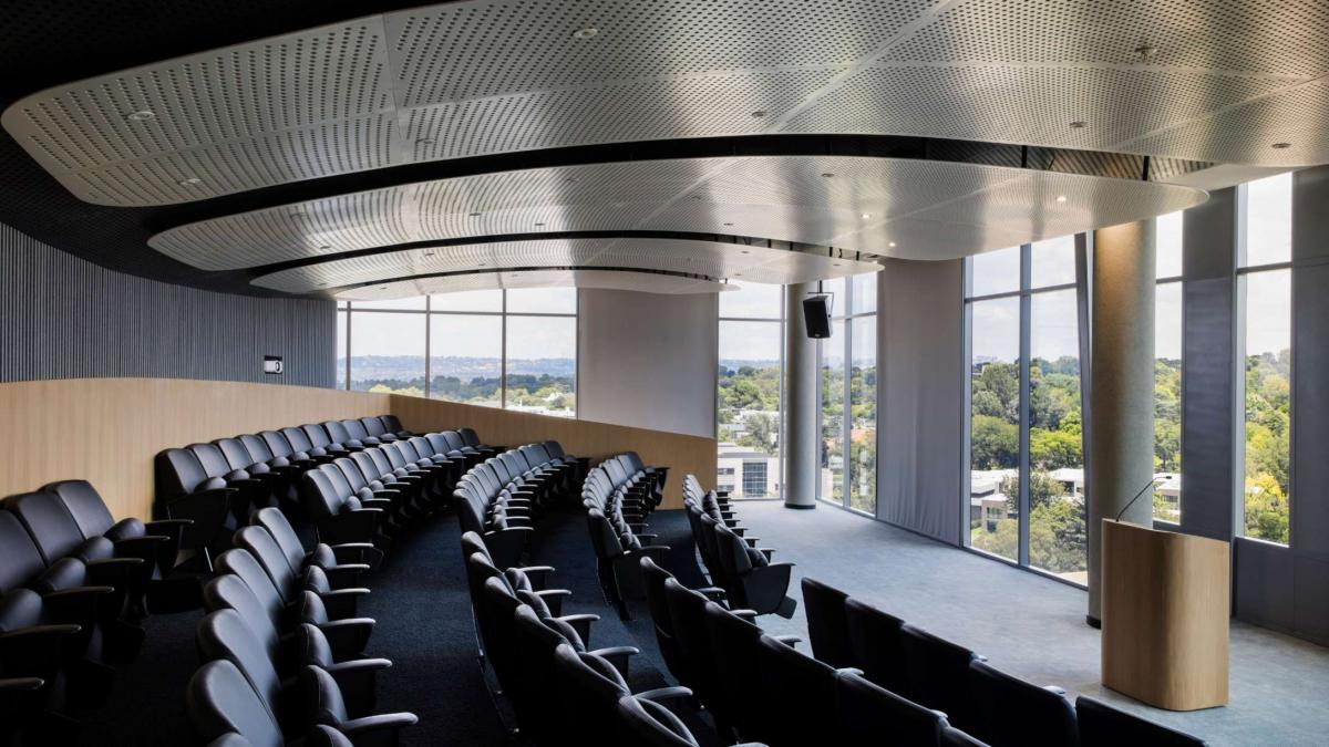
The southern wing contains a client entertainment area, in addition to an auditorium that is glazed on two sides to allow for breathtaking views over Johannesburg. The auditorium posed a particular technical challenge in terms of its acoustics and unique positioning.
Peregrine and Citadel occupy L6 to L10, consisting of Peregrine Capital, Citadel Wealth Management, A2X and Peresec. The latter is a newly-listed company on the Johannesburg Stock Exchange that takes up L9 and part of L10, which is a hi-tech trading space that includes a bar and entertainment area, with panoramic views over northern Sandton.
“A main feature of our design approach was to give each and every one of our clients a distinctive look and feel, especially as each one has their own corporate identity,” notes Schoombie. This was achieved by means of specific furnishings, colour palettes, fabrics and fixtures, while also accommodating the specific technical requirements of such financial services companies.
While the entire 1 Park Lane project was handed over in September last year, Schoombie has maintained close contact with her clients to gauge how the different companies have adapted to their new office environments.
“One of the biggest changes has been from a traditional closed-off office plan to a more open-plan set-up. We spent a lot of time with these clients to ensure that a level of privacy was maintained while still taking optimal advantage of the natural light and creating a more open collaborative space,” Schoombie concludes.
View Portfolio images for this project


